

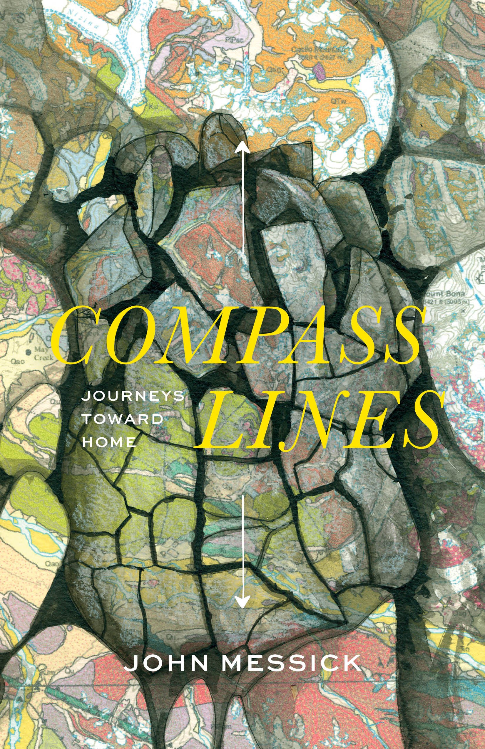
Cover and Variation

We’re pleased to reveal the cover of our second title, Compass Lines: Journeys Toward Home by debut author John Messick, forthcoming in March 2023.
We’re also glad to feature Kristin Link as a Porphyry Press cover artist. She created the maps included in our first title, Cold Mountain Path. On this round, we selected a piece of her art for the book cover.
I asked Kristin to comment on the artwork. She said:
“In October 2018, Jeremy Pataky sent me a collection of photos, poems, and vintage maps to kindle a potential collaborative project between the two of us: his works paired with my drawings. One of the photos was of a puzzle rock, cracked and broken with its twenty-something chunky blocks still in place, nestled among other rocks on a river bed.
“It reminded me of a map, the way states or counties fit together: many pieces that form one structure. I drew that rock on a USGS geologic map of the Wrangells with pen and ink. There is a scale shift as the viewer travels from studying something close up (a rock that might fit in your hand) to a large area the size of a small country.
“I love drawing on maps because the colors and shapes that indicate bedrock mix with the actual texture of what is observed in the rock up close. As an artist I cover some areas with a wash or with pen and let other areas show through. I’m drawing my own map of my own understanding of my home.
“It’s an honor to have this illustration featured on the cover of John Messick’s forthcoming book, Compass Lines. His story is one piece of a puzzle that fits in with my own. John married my close friend, who I moved up to Alaska with shortly after we both graduated from college. I helped Mollie and John pack their things into Bremner the summer that they volunteered there when Mollie was pregnant with their son. John’s Bremner essay finishes his book.
“Our stories twist and turn like the lines on a map. They crack apart, yet hold together. A rock is both metaphor and story, relatable and abstract, and it usually seems at home wherever it is.”
Here are two questions every book publisher must answer, book by book: by what method should copies of the book be physically made? How will those books get distributed to readers?
The answers directly determine how our books look and feel. In our case, you might be interested to know, the answers led us to a decision: we’ll release some copies with the cover above, and many with a different one that reveals a bit more of Kristin’s artwork.
For Porphyry Press, which values well-written literature, we prioritize good design and printing so that our physical books themselves honor the content. That is why we commit to making the most aesthetically pleasing, crisply printed, durable books we can, qualities best achieved on an offset printing press.
Also called offset lithography, offset printing is a method of mass-production printing in which images on metal plates are transferred (offset) to rubber rollers or blankets and then to the print media (paper, in our case). The paper does not directly contact the metal plates. It’s a tried-and-true, old school approach still preferred by most big and medium publishing houses, and some little ones like us, because the image quality you get with it is very high and totally consistent.
The disadvantage is that setup costs can be spendy, and every book made must be paid for up front and then stored until sold. (Four thousand pound book shipments take up a lot of space.)
Books that aren’t offset printed are made on digital printers. Much like the printer you’d connect to a home computer, digital printing takes digital-based images, like the PDF of a book, and uses a large-format inkjet printer to recreate the image directly on paper. The process does not require plates, so the setup time needed is just a fraction of what it would take to set up the similar job on an offset printer.
Offset printing, the industry standard, is acknowledged as best in terms of versatility and print quality. That said, digital printing has improved so much in the last decade that it has become viable even for book publishers who care a lot about print quality. And the means to print only what you want, when you want it is a big advantage.
Beyond actual printing methods, a real crux for any press is distribution—the process and logistics of making books available to people. It’s an entire industry unto itself for a reason; the number of new books published every year around the world is staggering, and there are myriad publishers out there. Booksellers need centralized hubs from which to stock up.
Book distributors store publishers’ books, actively try to interest wholesale buyers in them, and fulfill those orders. It’s an essential service to the publishing industry, but one that doesn’t necessarily work for a young micropress like us. Even with multiple awards, thousands of sales, and a second printing of a first title under our belt in one year, it’s a near impossibility, long story short, to become a client of a traditional book distributor without putting ourselves out of business. Without some form of distribution, though, wouldn’t we effectively make it impossible for bookstores to stock our books? A bit of a catch-22.
As we worked toward launching Porphyry Press and researched all options, we eventually landed on a hybrid approach to both printing and distribution.
So far, with our first two titles, 1) we make large offset print runs of copies to sell directly to individuals and those beloved indie bookstores willing to buy directly from us (heroes all! thank you!) and 2) we also set each title up through a print on demand (POD) system run by Ingram Book Company, the largest book wholesale distributor in the world. Most bookstores source most of their books through Ingram.
As a fresh and bright-eyed publisher, I entered the arena with a bias toward offset printing and a perfectionistic attitude about books as objects.
I was glad that some of the best offset book printers in the world are in North America (whereas lots of books on shelves near you were probably printed in China). One in particular, called Friesens, even has a high-quality, 100% post-consumer recycled paper well suited to our needs. We’ve given Friesens our business and have been pleased with their work. If the time ever comes that we do a short-run title of, say, 500 copies or fewer, we well might test the digital printing waters. Time will tell.
Fortunately, it turns out that the print quality difference between our offset books and our POD books is mainly a hair-splitting distinction. Digital printing has gotten to be quite good. Most people can’t differentiate between nicely done digital and offset printed copies. Using Ingram’s POD system allows any bookstore from California to London or wherever to order our books in any quantity as a constituent part of their regular ordering.
Meanwhile, having our own inventory of highest-quality offset books allows us to fulfill direct orders from bookstores and individuals in a way that keeps more dollars in our local economy (including royalties checks to authors.)
There are pros and cons to using two methods to produce each title and to using two different distribution channels. By functioning as our own distributor of offset copies, we improve our margin just enough to exist at all. Meanwhile, using Ingram’s print on demand service is a mild compromise that puts our books in reach of any bookstore that might want to order some through familiar sources.
A rub to this hybrid model is that there’s no built-in promotional support, as one could expect from a traditional distributor. That means it’s entirely up to us (by “us” I mean the press, our authors, and you, our readers and stockists) to let bookstores and libraries know that their shelves are incomplete without Cold Mountain Path, or without Compass Lines, or all the titles to come.
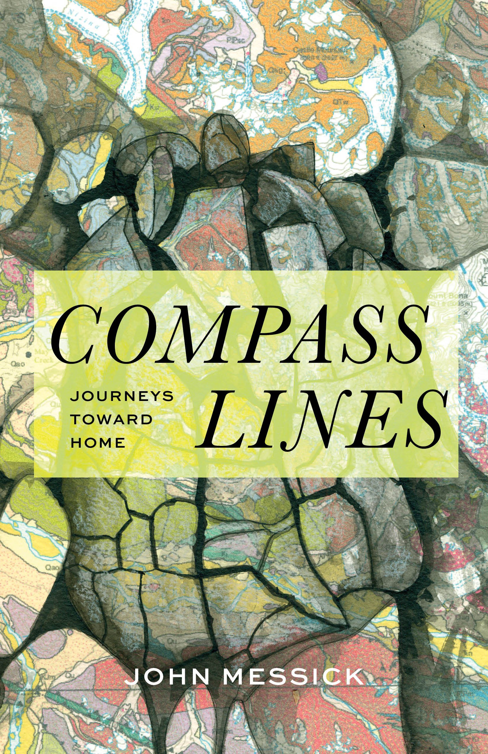
These ins and outs of printing and distribution methods have played a part in how our second book will appear, with Kristin’s artwork on the cover (and John’s inside.) As described, we’ll use two different printing technologies to print copies of Compass Lines. And we chose a particular piece of cover art and a design that wouldn’t render equally well in all print and digital formats (ranging from cover images on websites, to the cover of the ebook version, to physical books printed two ways.)
A solution is to release the book with two variations of the same cover. The primary cover image for Compass Lines, shown above, will represent the book online, in ebooks, and POD copies. Physical books with this cover will be distributed through Ingram. (Fortunately, most of the bookstores in Alaska, and some beyond, are willing to buy directly from us, which helps.)
It’s so often the case that one size does not fit all. You’ve got to be able to read the title on a book cover, of course, which is where that green box comes into play above for POD hard copies and electronic display. Given all the options available from an offset printer, though, which we were committed to using anyway for our significant offset run, why not pull out the stops to make best use of that method, even if it those books would appear a little different than those made the other way?
At the offset shop, we can apply colors that just aren’t available on a digital printer. This added versatility will allow us to make the title pop quite legibly off the page, even on top of that artwork that might otherwise camouflage the text. We’re extra glad to have already embraced offset printing for Compass Lines because, as the design has come together, it turns out that we can take advantage of its abilities to showcase Kristin’s artwork even moreso than the version folks will see online, on ebook readers, or on print on demand copies. Those will all still look great, to be sure, just different.
Anyway, while screens won’t do justice to this version designed for five-color offset print processing, here’s that second version:
Being a micropress committed to producing high-quality books that can be made easily available far and wide takes some improvisation, especially as paper prices and shipping have skyrocketed. In the last couple decades, publishing has changed a lot, in part thanks to the improvements in digital printing and the nimble-making print on demand options.
Having decided on the right cover artwork for Compass Lines, we are pleased to have the autonomy to present it two ways. We’re also excited to spotlight the work of two artists with the book—debut author John Messick, of course, as well as Wrangells-based visual artist Kristin Link. It’s a community lift.
Thanks for being part of it.
Jeremy Pataky
Publisher, Porphyry Press


Presales open in January.
Pre-orderers will receive offset printed first editions.